Showing posts with label design. Show all posts

Sunday, December 7, 2014

Home for the Holidays . . . and All Year Long

Hellebores on my father's antique desk in the dining room.  


I've been wanting to write an update about our house all fall, and I'm finally getting to it now, at the very time that Compass is running a series called Starter Stories, featuring bloggers posting about their first apartments, their starter homes, or the homes that gave them a fresh start.  Urban Compass is a very user-friendly real estate platform that connects folks looking for apartments in NYC with neighborhoods that suit their personality and preferences.   


The side table at night in the dining room this past fall.  
I'll share a photo later this week of it with the manger for Christmas.  


I'm excited to participate in the series, since we've lived in seven apartments, one loft condo, and three houses over the twenty-four years that we've been together, and I know a thing or two about the challenges and rewards of finding just the right place to call home--whether it's your first place or your eleventh!  And while this wee cottage is far from our starter home, it has definitely been our start-over home.  


Old books find their way into every room in the house.


As I've written about before, I believe that a place can save you, if you let it.  Mr. Magpie and I moved back here to Portland, Maine, after two decades of school and jobs had carried us off to distant places.  Returning to the city where we first met was probably the most important decision we've ever made for ourselves as individuals and as a couple.  We'd gone through a heartbreaking time in our lives, and we desperately needed to move and start fresh.  But we couldn't just sell our loft condo in Massachusetts, buy a house here in Maine, and be done with it.  The recession had dropped to its lowest point, and our condo's mortgage was under water.  Selling wasn't an option. So, like many other folks at the time, we rented the condo out to tenants, and then became tenants again ourselves.  After several years of being homeowners, it was a bit of an adjustment, but a necessary one if we wanted to live in Maine.


An autumn vignette in the living room


We rented here in Portland for a couple of years, saving our pennies and biding our time until we were finally able to buy our home in the summer of 2012.  It was actually a more exciting day to me than the day we bought our first home.  As some longtime readers know, during the first month after we moved in, we set to work right away, making this place our own.  One of the first things we did was to paint the rooms in shades inspired by the Maine coast.  In the two years since then we have expanded the gardens outside each summer, turning them into tumbling, colorful cottage gardens.


The Hobbit Garden in midsummer, with phlox, bee balm, Abraham Darby roses, lavender, salvia, and petunias blooming.

Scarlet runner beans and nasturtiums at the back door.  In the foreground is a Bridal veil spirea.
Looking from the spot where the Hobbit Garden (named for its curving wattle fence) transitions into the little woodland garden.  On the other side of the fence are our herb gardens and the patio.  The wild looking arbor is made from branches and this past summer it was covered in scarlet runner beans and sweet peas.


One corner of the herb garden ( taken in Fall 2013, while we were building the arbor)
As much as I love the gardens, I find myself also loving winter hibernation in this house.  The Christmas season never fails to stir the most domestic of feelings in my magpie heart.  As soon as the first snowflakes fall, I'm lighting a fire in the fireplace, baking shortbread, and stringing fairy lights in nearly every room.  I can't help myself.  


Christmas 2012


Our bedroom/sleeping loft
A few days ago we made our now annual trek to a local tree farm to cut down the Christmas tree. It was a blustery, frigid afternoon, and the muddy pathways between the trees were coated with a sheer slick of ice, so it was tricky to even get to the trees, let alone saw one down, but we managed, bringing home a smaller one than usual to fit into one corner of the living room.  


Late afternoon at Staples Tree Farm


I've also draped the mantle with fresh greens from the trees in our yard, tucking in pinecones that I've iced with silver glitter as well as the bird nests I've found on the ground over the last couple of autumns.  Our yard is home to many birds, squirrels, chipmunks, and other wild beasties, and we feed them seeds and water year round.  For Mr. Magpie and me, our home wouldn't be complete without the wild creatures outside as well as the wild ones inside (Scout and Dill, our tuxedo cats). 


A closeup of one of the nests on this year's holiday mantle.  I'll have more photos of the whole mantle and other decorations soon!


The kitchen windowsill at suppertime with a string of fabulous Starry Starry Lights


The tree is now up and decorated, but I've still got work to do.  There's the manger to finish, and the sparkling winter village.  The ever-thoughtful Mr. Magpie bought extra strings of fairy lights, so you know I'll be plugging them into every available outlet.  I think it's time to play some Christmas CDs and mull some apple cider.  The holidays equal home for me, and this year more than ever, I'll be grateful to start a new year in our little white cape beneath the great white pine.  


Thursday, November 13, 2014

Fall Botanicals: Tips for Arranging Floral Patterns


Earlier this fall during my annual cleanup of the gardens, I began putting some of the colorful leaves, blossoms, and berries into a basket.  Their shapes and textures were so beautiful that I decided I needed to do something more memorable than just plunking them into a mason jar to keep on the windowsill for a few days.


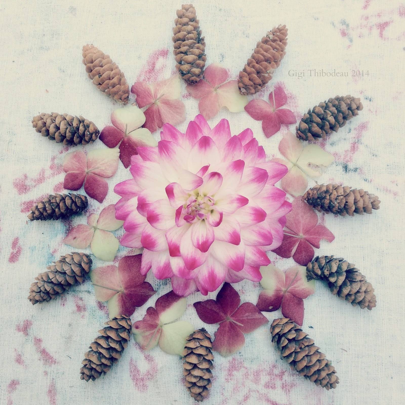
Using a worn old tablecloth as my makeshift backdrop, I arranged torn petals from marigolds, nasturtiums, and hydrangeas into simple medallion shapes on my picnic table.  I combined them with tiny pinecones and whatever else I could find in the yard, and then I grabbed my iPhone and snapped a few shots of the various arrangements.

I had to work quickly, as it was a chilly afternoon, and my fingers were growing numb, but I found that the more fanciful I got with the arrangements, the more I was loving them.  Later that evening, safely inside with a cup of Earl Grey, I processed the photos on my laptop and then shared a few of them in a post here on the blog, as well as on Instagram and Facebook.


I was quite surprised and touched by people's reactions.  Some folks even emailed to say that they thought I should turn the images into greeting cards.  I've been making and photographing more of the arrangements since then, and I had some prints done on Shutterfly.  I'm on the hunt now for some vintage gilded frames so I can hang the prints in our guest bedroom.


Today, as I worked on the latest in my "Autumn Gatherings" series, I took photos of the steps as I went along so I could share the process with you.  This isn't really a tutorial, since anyone can arrange flowers in beautiful patterns, but I have discovered a few tips along the way that really work for me, and I hope they may be helpful for someone else trying this.


First, the background is key.  If you want your arrangement to have a sort of vintage, nostalgic look, it's  helpful to begin with a vintage background.  Today I used this wrinkled, worn, and faded piece of Irish linen that I've had for years.  The colors of the flowers printed on it are just right as a backdrop to autumn leaves and branches.  (In fact, I used this same fabric as the background for my Artful Blogging post.)


Next, I gathered from our yard whatever flowers, berries, twigs, leaves, cones, and seed pods struck my fancy.  If your backyard happens to be more of a wooded forest, be careful, as some plants can be poisonous. 


Here in Maine, we're deep into autumn, but I still have a few hardy flowers blooming in my garden beds and in the pots on my front porch, so these were musts for me, plus some scarlet runner beans left on my arbor, and the last of the husk cherries in their lovely paper-lantern shells.  Various shrubs and woody perennials provided lots of great material, too.  The most important thing is to find an interesting range of textures, shapes, and sizes.  The colors this time of year tend to be fairly easy to harmonize.


Now that it's getting really chilly out, it's easier to work inside, so once I'd gathered my materials and placed any tender stems in water to stay fresh while I was working, I stationed myself on a large table on my sun porch, which was ideal, as it gets flooded with a particularly lovely warm, golden late afternoon sunlight this time of year.  


I began by playing with colors and shapes.  I tend to lean toward ovals and circles for my designs, but other shapes would, of course, be beautiful, too.  What I love about making medallion shapes is that you can have a beautiful, useable shot at almost any point in the assembly process.  If you want something as simple as the above mini pumpkin surrounded by geranium leaves, this would be nice as is.  You could move right on to cropping and processing the photo from here.  


I found myself smitten with this sweet little robin's nest that had fallen from one of the mock oranges bordering our yard.  I would never steal a nest from birds, but I do collect the windfall nests that I find on our property every autumn--or you could fashion a little nest yourself from twigs and moss.  This one just seemed like a perfect centerpiece for my medallion.


I love varying textures, shapes and colors, and then repeating certain ones for effect.  Once I had placed the yellow flower (the last one of the year from my porch planter) in the center of the nest, I knew that I would want to pick up on that yellow and accentuate it.  So, I simply played with possibilities.


Lamb's ears are particularly wonderful because of their silver-green color, their spear shape, and their fuzzy texture.  I love them contrasted with the azalea leaves that I've laid on top of them; the azalea's leathery texture and its burgundy color contrast beautifully with the lamb's ears, but both plants are the same basic shape, so there's some repetition, too, which is always pleasing to the eye.  The dark purple leaves radiating out from beneath the geranium leaves are from one of my many forsythias.  They repeat the same shape, but offer yet another color.  Plus, as yellow's complementary color, purple is a great back layer.  


As with any creative process, a huge part of it is trial and error for me.  I tried adding bits of pink begonia blossoms along with the purple and pink scarlet runner beans, but then the whole thing started feeling just a wee bit Easter-y, so I scrapped that idea and continued on.  This time I used much more autumnal petals of orange marigolds and red nasturtiums.


In the photo above I felt I was nearly finished, but I wanted one more layer to give it a sense of blooming out almost beyond the borders of the frame.  


My final step was to add some lavender leaves to the outer tips of the forsythias.  They pick up on the silver of the lamb's ears, and they also repeat the shapes of the central flower blossom petals.  I love that not all the leaves in the image are exactly the same size, and I never fuss over making things exactly symmetrical.  Perfectly imperfect suits my eye and temperament much more.

Finally, when it comes to processing the photos, I tend to play with lightening the exposure just a little bit.  I also sometimes blur the edges of the image, as I've done in the photo above.  Many of you are incredible photographers and much more brilliant than I at photo processing.  If you're newer to it, you don't even need to be a Photoshop expert.  Try using a simple online photo processor.  Most of them have loads of ways to give your photos a vintage look.  Or, simply snap away on your phone and use a processing app to get wonderful results.  If you want to see live examples of how others process their photos, YouTube is always a great teaching tool.  The version below is finished off with a final texture layered over the top of the image.  The texture is a photograph of another piece of old linen, which, once processed, gives an even more vintage look to the image.


Before I have Shutterfly print up my next round of photos (and my first batch of "Autumn Gatherings" greeting cards), I'll likely play with each image a little more, tweaking it until I'm satisfied with the results.  For me, the most important aspect of making this series is how much fun it is to create beautiful patterns from the bits and pieces I've gathered from my own backyard.  Now I can hardly wait to make the "Winter Gatherings" series.  I'm already imagining the dreamy Christmas cards.  Holly, pine, and arborvitae, here I come!


Friday, February 8, 2013

February Crushes: Old Town Work Wear


Photo by Matt Hind

Okay, here's crush number 2: the men's workwear chic clothing from British company Old Town. To see a beautifully inspiring photo shoot at London's Red Lion Pub (a classic pub in every sense, which also happens to be the first pub I ever visited in London, many years ago), take a peek at Piccadilly Pleasures.  I think Mr. Magpie has as big a crush on this clothing as I do!

    Friday, December 21, 2012

    Blue (and White) Christmas


    I hope all my friends here in the northern hemisphere are safe and warm on this winter solstice.  It is very dark, very windy, and very rainy on the coast of Maine tonight.  The wind is so strong that it's pushing the smoke right back down our chimney, but we are warm and dry inside, and I could not ask for more.  The Christmas tree is twinkling and the candles are flickering on the mantle.  I've made a huge batch of needhams, that very special Maine Christmas candy treat made with potatoes, coconut, and dark chocolate.  I promise to share the recipe later in the weekend, but for tonight I thought I'd finally share a few shots of our bedroom.


    We decided to decorate it for Christmas with a lovely branch that had been blown down from one of our trees during a storm.  The branch strung with a few lights was all we needed to bring a little sparkle to this dark time of year.  I had planned to hang crystal icicles from the branches, but once the lights were on, I loved it as it was.

    The bed we bought locally at The Furniture Market in South Portland, where the fabulous Mimi helped us decide on this rich navy blue color.  We ordered a model with drawers underneath, and I am so, so glad that we did!  Between those drawers and that big old chest next to the bed (bought cheap from friends who were moving), we have tons of storage.  The bolster on the bed is an old French grain sack that I found at Montsweag Flea Market this past summer.  I made the smaller pillow from a very sweet tea towel.  That wonderful ladder leaning against the chimney in the first shot was a gift from my sister, who bought it a couple of years ago at the Bath Antiques Show (formerly owned and operated by my mum, now run by her friend Paul Fuller).

    The walls and ceiling of the bedroom were never really finished off, as this was once the attic of the cottage, so we simply painted over the knots in the pine with sealer and then whitewashed everything.  We wanted it to feel rustic, but also bright and clean.

    On another painting note, I wanted to mention the white paint on the chimney.  The chimney was not painted when we moved in.  If you've ever considered painting brick but were unsure about how it would work, have no fear.  As long as you prime it correctly and use the proper masonry paint, you will have no problems at all!  Benjamin Moore has everything you need to to the job beautifully.


    Our bedroom is really more of a sleeping loft, with our two studies just off to one side.  One end of the loft has this wonderful, beat-up old dresser that we bought from some friends, plus our now infamous boot collection, and our old suitcases full of CDs.  

    The floor is hardwood, but it was in terrible shape when we moved in, so we decided to paint it a very soft grey, which we couldn't love more.  I found the blue and ivory shades for next to nothing at Christmas Tree Shop a few years ago.  We hung them in our last apartment, then brought them along with us to the house.  I'm so glad we did, as they fit this room perfectly!


    Above is a detail of the old trunk beside the bed.  That mirror is a lovely vintage one I found in a junk shop in Bloomington, Indiana, about a hundred years ago.  The ironstone pitcher is one from my collection.  I love tucking eucalyptus into my ironstone pitchers this time of year and just letting it dry around the house. 

    If you look closely, you'll notice that the trunk has pencil and marker lines on it.  These were scribbled by our friends' daughters before they sold us the trunk.  I don't have the heart to paint over them.  Somehow they add to the trunk's charm for me.   


    Ah, and then there are the lockers.  Mr. Magpie and I bought these three years ago at a great antiques shop in Hallowell.  If you like antiques and plan to visit Maine anytime soon, Hallowell is a must.  I've written about it before, because I love that little town, plus you can always grab lunch at Slates.  Yum.

    I should mention that the lockers were bright orange when we bought them, but they cost almost nothing, and I just spray painted them white.  Easy peasy.

    The doctor's bag I bought at a flea market--probably Montsweag--and the old French house number I found in London at Spitalfield's Market.  Is it obvious by now that I am a flea market kind of magpie?  The shot below should seal the deal.  I love sparkle, and so you can always find bits of vintage sparkle around our bedroom, as well as the rest of the house.  Here it's hanging from an old metal hook in the wall.


    Hope you enjoyed this peek into the sleeping loft.  I have a few more Christmasy photos to share later in the weekend, plus that Needham recipe, which probably sounds just awful, but I promise is delightful!  

    Until then, sending a sleighful of Christmas cheer to you and yours.  xo Gigi


    Friday, September 21, 2012

    Chip Tease: On Paint Colors and the Coast

    Note: Buckle up, my friends.  We're in for a long one.  I've been away for ages, I know, but mostly because we've been painting.  And painting.  And painting.  If you're as crazy about paint and colors as I am, or if you want some interesting links to things paint- or Maine-related, then read the text.  If you just want to see colors and pretty pictures, please feel free to skip my ramblings!

    I have a longstanding obsession love affair with paint, as does Mr. Magpie, and we have been talking nonstop about colors for the cottage ever since the day we stood in its kitchen with our realtor and emailed in our offer.

    Ultimately, I think every color we've chosen has been inspired by one thing: the coast.  More specifically, we've been inspired by two coasts, one we live on and one we've never even seen in person before.

    Photo I took on the island three years ago.  On the right are mason jars filled with the sea glass we gathered that fall.

    Ever since those four months that we spent on Peaks Island here in southern Maine three years ago, I have dreamed of a room painted the color of my favorite pieces of sea glass.  Benjamin Moore's Palladian Blue is just that color.  As soon as it went up on the walls of our living room, I knew it was right.  It shifts all day long in the changing light, from blue to green to both, combined with a touch of soft gray.  Sometimes it feels like the sky, other times like the shallows of a sandy beach.

    Benjamin Moore Palladian Blue

    Oh, I should mention that we've done all our walls, including the kitchen, in a matte finish using Benjamin Moore's Regal Select paints.  This paint is very durable and washable.  Yes, we've already had to wash some spots--moving is dirty business!  This paint is also incredibly easy to work with.

    If you're a local reader, you might be interested to know that we've bought all our paint at Maine Paint Co. on Forest Avenue in Portland.  Working with a local store has been wonderful.  Folks there knew us by name after just a couple of visits, and they have been helpful with every question we've had, whether practical (Q: "When is that floor paint ever going to cure?"  A: "Fifteen days.  Be patient." And they were right.  It did take exactly fifteen days.) or aesthetic (Q: "Should we dare to paint our dining room a very dark and dramatic color?"  A: "Yes."  Emphatically.  And they were right.  Or more precisely, she was right.  Tanasia at Maine Paint has been a color consultant extraordinaire).  And this dining room color question leads me to the next chip: Newburg Green.

    Benjamin Moore Newburg Green

    There is a story behind this beautiful color, which, on our dining room walls reads sometimes as navy, sometimes as deep teal, and sometimes as nearly black.  Gasp.  Serious drama.  I am in love. Remember how I mentioned a coast we've never seen in person?  Over the summer, the Portland Museum of Art hosted an exhibition called The Draw of the Normandy Coast, featuring French and American artists of the 19th and 20th centuries who were inspired by the cliffs and ports of Normandy.  What impressed us upon first arriving at the show were the walls of the gallery themselves, which some brilliant people at the museum had painted a very deep marine blue.  Against this backdrop the Monets, Whistlers, and Dufys were stunning.  Again and again we found this blue in the paintings themselves--sometimes darker, sometimes lighter, but variations on deep, briny blue with hints of green.  Wouldn't we love a room in a color like this, we wondered.  Well, yes, but we hadn't found a house yet.  We were putting the cart well ahead of the horse.  In fact, the horse was still nowhere in sight.  

    And then we found the house.  And then we thought, it's a little cottage.  It should be all light-filled rooms and whitewash and sea glass.  We forgot all about the Normandy coast.

    But there sat our dining room in the darkest corner of the house with two windows, one of which lets in little light at the moment due to an overgrown (not for long) viburnum rubbing against its panes.  A dark room, indeed.  We decided to fight the darkness.  We talked with Tanasia.  She sent us home with lots of wonderful samples in light and bright colors.  None of them worked in the room.  We went back to the store.  We talked some more, and the ever-patient woman asked us questions, offered ideas, and listened to our color woes.       

    And then it happened.  There on the table in the paint store was a copy of Maine Magazine.  I absentmindedly flipped through it while we chatted, and I was about to set it aside when it fell open to a page advertising the upcoming Winslow Homer exhibition at the Portland Museum of Art.  It's difficult to describe the buzz surrounding this exhibition.  Pretty much everyone I know can't wait to go; nor can we wait for the tours of his famous studio at Prout's Neck.

    Winslow Homer, Eight Bells, 1886

    But that's not what I was thinking about at the moment.  All I could see was blue.  That spot of blue in the break in the clouds.  And suddenly the Normandy coast was back.  And the Maine coast.  And I showed it to Todd, and we both knew.

    So the color we chose is called Newburg Green, and there is green in there, but only to serve the blue, and like the ocean and sky along a northern coast, that blue is ever-shifting and changing with the day and the whims of the weather.  I can't wait to show you our dark dining room.


    Benjamin Moore Mountain Peak White

    Now onto trim and ceilings and doors and even the brick fireplace.  I love white for trim and doors, especially in a cottage, but I know how hard it can be to choose.  Too much yellow in it and it can feel dirty; too much blue and it feels cold, etc.  I think we simply must test it at various times of day against the other colors we plan to use in a room.  A white can look hideous at the store under their fluorescent lights but be a stunner in sunlight or under incandescents.  The opposite can be true, as well.  I've fallen in love at the store only to find once I get it home that the crisp white I thought was the color of sun-bleached seashells is actually the yellow of a chain smoker's fingernails.  

    I wasn't expecting to like Mountain Peak White, but its sample was the one color that matched the bead board cupboards (be still my heart) in our kitchen, and I knew I wanted to paint the kitchen walls the same color as the cupboards to make the whole room light and bright and airy, so I went with it, and guess what?  In our house it looks clean and fresh without being blinding.  And it may have an alpine name, but it feels wonderfully seaside cottage-y, so it soon spread to the living room and beyond, until before we knew it, we were using it on trim (in semigloss) and ceilings (in pearl--after reading this post over at For the Love of a House, I don't think I will ever paint a ceiling with flat paint again) throughout the house to unify all the various colors.  In fact, we worked hard to find colors that we loved and that also resonated with the white as well as all the other colors in the house.  Against the Palladian Blue, Mountain Peak White feels soothing and creamy.


    Dream Beach, Reid State Park, Gigi Thibodeau 2010

    Have you ever been to a beach in Maine?  The sand here varies from beach to beach, depending, of course on the rocks found surrounding the beach.  We don't really have white sandy beaches; they tend more towards pale grays and grieges.  One of my favorite beaches is Reid State Park, where I spent countless hours in the waves as a kid.  I took a series of photos there a couple of years ago, and I find myself thinking often of the color of the sand at Reid.
     
    Benjamin Moore Pashmina

    And so, my study is in Pashmina, also by Benjamin Moore.  It's a warm greige that sometimes feels much grayer, depending on the time of day.  And it always reminds me of the beaches along this part of the Maine coast.

    Farrow and Ball French Gray

    And for his study, Todd (aka Mr. Magpie) choose Farrow and Ball's French Gray--another very Maine coast color with a touch of green in it.  In his study it is warm and rich like moss, and just perfect for a reading room.  I promise to give you a peek soon!  

    I haven't mentioned yet that we've turned our entire upstairs into a sort of work/sleep/hangout space for the two of us.  When you climb the stairs, you enter a large room with skylights, which is paneled entirely in bead board that we've painted with the Mountain Peak White.  That's our bedroom.  Love. Serious love.  

    The floors in there are hardwood, but the boards were in rough shape, and we have a limited budget, so we decided to paint them.  And what cottage is complete without at least one painted floor?  With the white walls and the navy blue bead board bed we're soon to have--after 22 years we have bought our first new bed--we decided to go with a beautiful neutral floor color: Thundercloud Gray.

    Benjamin Moor Thundercloud Gray

    On our floors it is even softer and lighter than this sample.  And while that Mountain Peak White sample looks very cream against the white of my blog, it looks much whiter and crisper beside this gray.  Have I ever told you that as much as I love a sunny day by the water, by far my favorite days along the coast of Maine look like this:


    Thus Thundercloud Gray and also a lighter, even softer grey with a touch of violet:

    Benjamin Moore Bunny Gray

    Bunny Gray is in our front foyer downstairs, which is a very small, but light-filled space with arches leading into the dining and living rooms.  We knew we needed a very neutral color here to allow the eye to move comfortably from one room to the next, and Bunny Gray did the trick. We tried it in an interior hall as well, but without much natural light, it actually read as violet rather than gray.  In a room with lots of sunlight, it reads as a beautiful driftwood color that connects with all the other ocean colors.

    Last but not least is the room we are finishing later today--the guest room.  When we moved in, this room was painted a deep burgundy red on the walls with a very orangey-gold ceiling.  Not at all cottage-y.  Not at all coastal.  Not at all us.  This room was the hardest for us to re-imagine.  It is on the first floor overlooking the garden, so we knew we wanted to connect it to all the beautiful greens right outside the windows.  The winner was a green that Benjamin Moore calls Spring Meadow, but it reminds me of the lichen that grows on the rocks near the ocean here in Maine.  

    Benjamin Moore Spring Meadow

    Hmm . . . I'm not happy with this sample.  It's nowhere near as lovely as the actual color, which is greener and richer than this.  One more reason I can't wait to show you the actual rooms, but I wanted to share some of our inspirations first.  I promise before and after photos (one room per post) soon!